Beyond Flat Design: Reclaiming the Joy of Dials and Buttons
I recently (and finally!) got to talk at length with author Cory Doctorow, who famously coined the perfect term for when technology platforms and products rapidly decline in quality. Enshittification.
Macquarie Dictionary
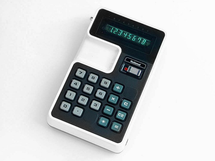
One of the most enjoyable things he shared with me was the polar opposite of that: A lovely little Tumblr filled with classic interfaces. It contains many examples of wonderful buttons, knobs and dials (the photos in this post are mostly found there).
My dad was a huge fan of Japanese electronics, so we naturally had a lot of record players and tape players designed like this in our home. When he couldn’t afford something, he’d build it.

My father had a good mind for functional design, and my childhood home was filled with his projects. A lot of them were built on the cheap, but they functioned beautifully. Others were not so successful, and I got to learn about what not to do from him, too. I’m lucky to have experienced early in my life about what technology could be like from him.
What We Lose with Flat Interfaces
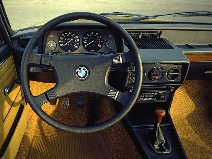
I think about how many people didn’t get to grow up with amazing physical interfaces other than light switches (and even these are getting flatter and more annoying to use). When we remove buttons and and knobs from our sensory environment, we lose:
Muscle memory: It takes a long time to learn how to ride a bike. But once we do, we never have to learn how to ride it again. Imagine that next time you try to use a fancy CRM system. Stop using it for a month, and it can feel like you’ve got to learn it all over again.
Tactile stimulation: Our brains crave tactile stimulation, and when we make everything flat we spend more time looking at interfaces than just using them. We don’t get to have muscle memory, and we don’t get to have a relationship with our devices. Instead, we have to pause our conversations, put our children on hold, and apologize to our customers because we have to look at them to use them.
Human time: When we miss seeing a child’s first steps because we’re busy downloading an update for a connected speaker system instead of being able to use it without software, we lose a little bit of our humanity.
Building without Building
Many designers and developers learn their trade without making physical objects. They make and use objects without tactile buttons. They render objects virtually without making them with 3D material. In doing so they miss a lot of the learnings that happen from physical materials. And even when a tech startup does get its user interface really right, like Figma, market forces of an acquiring company might force button menus to be moved around.
Slowly the experience of flowing through the interface and feeling like a superhuman begins to decline. And then it just feels terrible. There’s more focus on the tool, not the task. In a word: Enshitification.
Musicians and the Power of Pass-Through Interfaces
There’s a lot of music gear on the Tumblr devoted to Buttons and Knobs, which makes a lot of sense. Music gear is designed to be pass-through. That term, a core principle in Calm Technology, was coined by Xerox Parc’s Mark Weiser, who wrote back in the 90s:
“A good tool is an invisible tool… By invisible, we mean that the tool does not intrude on your consciousness; you focus on the task, not the tool.”
In other words, we need to be able to use it while doing something else (watching a synth or your bandmate’s guitar) — so there’s always been an incentive to design a musical instrument really well, and with physical buttons. There’s a consistency in musical tools for this reason.
When Retro isn’t Retro
I like to think about technology in a continuum where retro isn’t ever really retro. Some designs should stay there because they work. And as dials and buttons and knobs dissolve from cars and other tools, I’m hopeful the musician community might serve as an archive through which we might be able to wrestle physical interfaces back into our everyday lives.
While I don’t like Tumblr so much anymore (for the same reasons explained in this post) I am happy that people are still using it to collect a bunch of images that might serve as a reminder that tech can be designed differently from how we assume it must be designed!
As for moving our products and experiences away from Enshitification, specific recommendations are further explored on the Calm Tech Institute site:
Part 1: When 10 Seconds Means 23 Minutes: The Attention Costs of Bad Design
Part 2: Your Hands Have Eyes, Too! Engaging Peripheral Attention
Part 3: Designing Products for Resilience & Graceful Failure
Part 4: The Color of “The Future” Isn’t Calm: The Problem with Bright Blue Indicator Lights
Part 5: Beyond the Beep: Sound as a Core Principle in Calm Design
Part 6: Sensory Starvation: Why Our Brains Crave Natural Materials
Speaking of knobs and buttons, what are your own favorite devices?